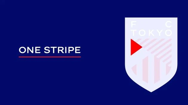
This is the freshly unveiled new crest for Japanese J1 League side Football Club Tokyo.
The new direction for “Gas” - focused on a marriage of the "inheritance" of a history and forward-looking "innovation" - sees the creation of a red-and-blue shield-based modern badge with the striping of the previous version rendered at 45-degree angles and the team name, “F C TOKYO”, in white.

Sign in or create an account to earn points for voting, keep track of your reviews, edit them, and more.
FOUR STRIPES
These four lines symbolise the club's core values: Frontline, Creativity, Diversity and Possibility.

ELEVEN STRIPES
The 11 upward lines highlight the unyielding determination of athletes, constantly aiming for triumph and pushing to new heights.

ONE STRIPE
This singular triangle stands for unity; fans, players, and the club advancing as one, echoing the "plus one goal" football strategy.

TOKYO STRIPES
These stripe patterns capture the multifaceted nature of Tokyo, a place where diverse cultures intertwine, reflecting the ethos of FC TOKYO.


