Southampton 24/25 Puma Home Kit

Southampton 24/25 Puma Home Kit

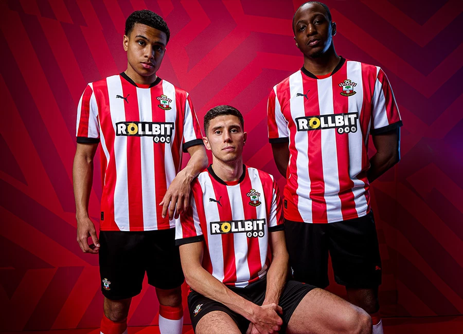
Southampton Football Club have unveiled their new Puma home kit for the 24-25 season.

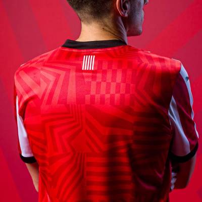
Inspired by Southampton's rich naval history, the design blends traditional stripes with dazzle camouflage patterns used on ships to confuse enemies. The innovative graphics disrupt construction lines, making it hard to pinpoint a ship's speed, range, and course.

The shirt features a black crew neck collar and black trim on the sleeves. The kit is completed with black shorts and white socks with red details.

Sign in or create an account to earn points for voting, keep track of your reviews, edit them, and more.

View the: Southampton 24/25 Away Kit

View the: Southampton 24/25 Third Kit

Load More


3.7
113 ratings
Vote now!
  • 8
  • 13
  • 16
  • 36
  • 18
  • 9
  • 13
i like football shirts
  • Member
  • 75
  • 4
  • 60
 · 1 month ago
Comment (Not Required)
Zero effort, the Hummel shirt from last season was miles better than this.
Show more
N7 Bluebird
  • Member
  • 402
  • 9
  • 18
 · 1 month ago
Comment (Not Required)
Hate seeing solid backs on striped shirts
Show more
  • i have different taste 1 month ago
    It's always been like that with striped shirt designs with contrast colors. Player's name and number visibility is very important.
SW11_Saint
 · 1 month ago
Comment (Not Required)
Glad to see red & white stripes back, but why do designers insist on these goadawful plain backs? It looks awful and spoils the whole design. It’s not hard to artfully incorporate a number on the back of a striped shirt. Must do better…
Show more
Razza
 · 1 month ago
Comment (Not Required)
Plain back time again.....marks off for that. It's about or below average that's all
Show more
Johninho
 · 1 month ago
Comment (Not Required)
Something decent from Puma, I'm shocked!
Show more
Ilias Chairsniffer
 · 1 month ago
Comment (Not Required)
When she gets up and leaves I would sniff her chair, i mean it looks more like Brentford
Show more
Paul
 · 1 month ago
Comment (Not Required)
Uninspiring!
Show more
Karl Largearsefelt
 · 1 month ago
Comment (Not Required)
Its ok i thought ...then i saw the back..it is a problem ...
Show more
Pomponian
 · 1 month ago
Comment (Not Required)
That is hilariously bad. Naval heritage?! Looks like an Exeter kit. The sponsor is horrendous too. Someone has put a lot of effort and money to come up with a collaboration and design this woeful. Congrats
Show more
Matt
 · 1 month ago
Comment (Not Required)
Dazzle camouflage to confuse your enemy.
Pardon me, what?
Show more